Why hibriden
Over a decade ago, as I embarked on my freelance graphic design journey, I faced the daunting task of choosing a business name. While I had a clear vision of design’s role, capturing its essence in a single word seemed impossible. I delved into the core concepts that shape design, hoping to find a fitting representation.
First ideas
As I explored my identity as a graphic designer, I became increasingly fascinated by the concept of duality. The Latin root of “identity” — idem (meaning “the same”) — highlighted the inherent contradiction in the word. This led me to ponder the countless ambiguities in our world. Time, self, and even the concept of a day itself can be interpreted in multiple ways.
Duality is a fundamental aspect of our world, a reflection of the ever-changing nature around us. With this in mind, I sought a word that could capture this inherent ambivalence.
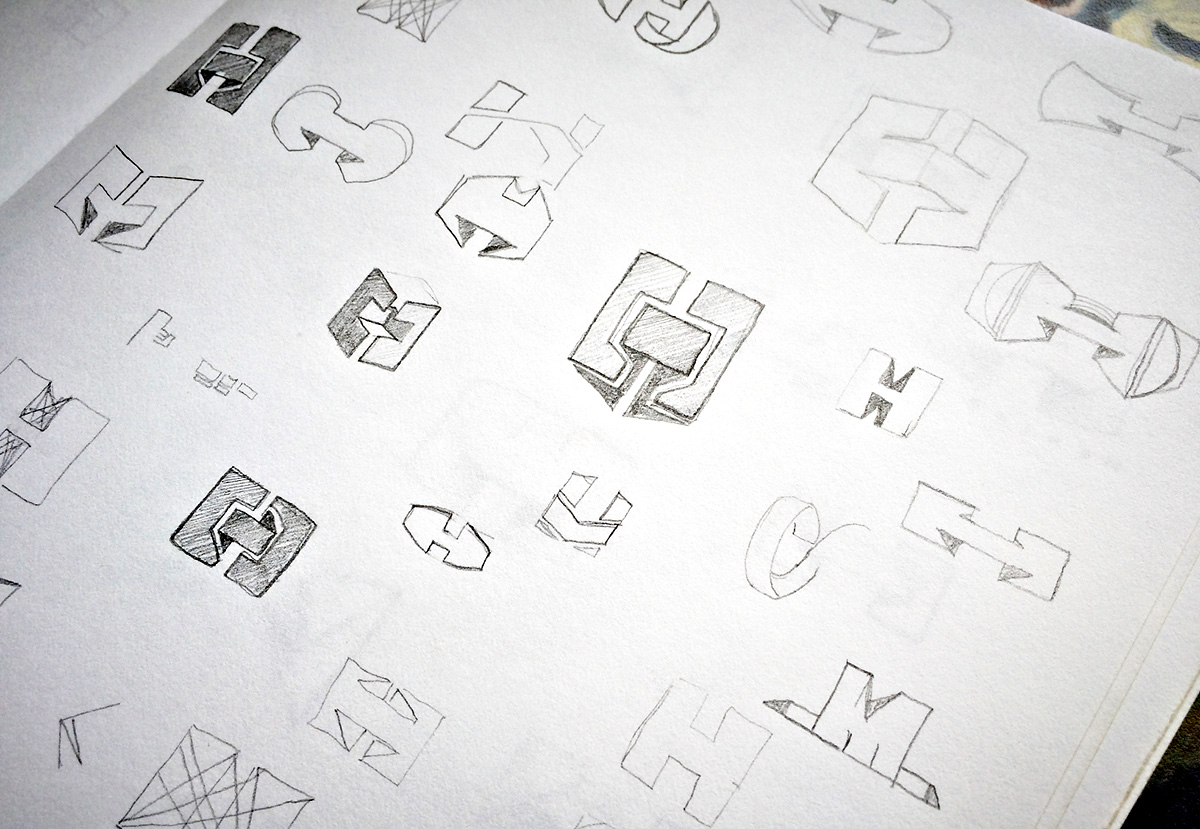
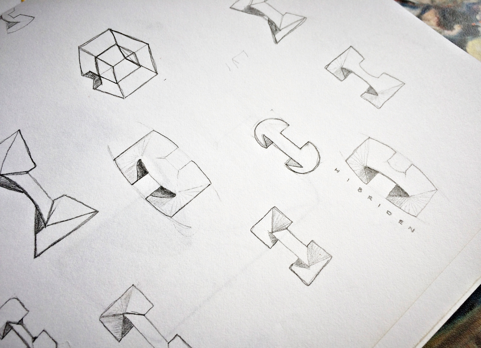
Logos sketch for hibriden
Hybrid
The concept of duality fascinated me, and I continued to explore its implications. I realized that our perception of almost everything can be altered, not just in visual design. While searching for a name, I experimented with various combinations of words related to identity, duality, hybrid, idea, design, and creativity.
After trying with several synonyms, translations, related concepts, I decided to combine words aiming to find a meaningful but simpler name. At the same time, the process of naming something “new”, was referring to the process in the name itself, it was the discovery of the dual identity of something, something similar to the “identity of a hybrid” …hibriden.
Process conclusion
The journey to find the name Hibriden was a transformative experience. It deepened my understanding of design,language, and human nature, reshaping my perception of the world.
Hibriden’s identity is rooted in the impermanence of things, the concept of duality, and the ever-evolving nature of our environment. Every interaction with a brand is influenced by past and present experiences, creating a dynamic duality.
Visual duality
Hibriden’s identity design is rooted in the interplay of opposites. Two angular figures, facing away from each other, are connected by a bridge-like element, symbolizing communication. This composition, reminiscent of a mask, represents the dual nature of identity and the complexities of human interaction.
0 Comments