

Bigmoat
Redesign identity project for a real estate company.
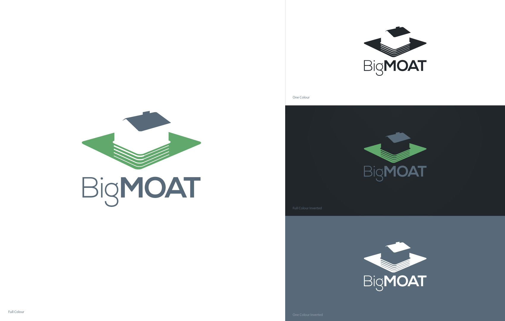
Solution
Using the “moat” definition as concept to create space as the supporting graphic element to represent protection, support, trust (this last one by using green colour). At the centre of the composition there is a house delineated by using negative space subtle shapes, without being too specific. Although being a real estate company this is important but not need to be as obvious. Font usage is san serif, friendly for reading and proportionally positioned to give a squared area to the whole composition. The most characteristic word is bolded to reinforce the concepts mentioned above.